REvitilizing a hometown fave
Agency: Interbrand
Creative Director: Oliver Maltby
Design Director: Izgi Yapici
Designer: Spencer Seligman
Design Fellow: Eddy Lee
Client Manager: Anna Young
Production: Jean Campbell
Awards and Recognition
Under Consideration Brand New
The Year in Review (2020): The Best–4th overall, 5th in packaging and wordmark
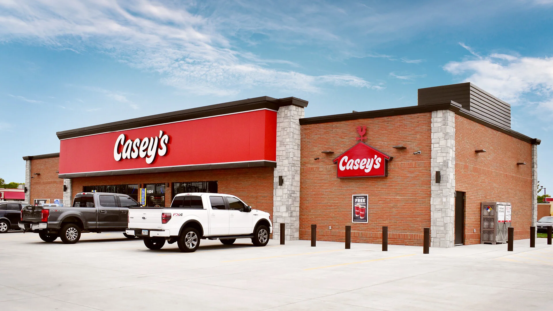
Often serving as the only grocer, gas station, pizza parlor in small midwestern towns, Casey’s is ingrained into the cornfield fabric of its communities. A pioneer of serving fresh homemade food, Casey’s has over 2,000 stores and is the 5th largest pizza chain in the country. While Casey’s had build its reputation on its quality food and personable service, their logo needed to be updated for modern, digital needs. Interbrand was challenged with contemporizing this beloved brand without loosing its charm, history, or connection to the communities it serves. Along with launching a new logo, Interbrand designed an expanded line of private label packaged products.
I personally touched all parts of this project from the logo conception through final mechanicals. I drew over 25 roosters to craft the final one used in the logo. I also managed the development of every pack design—including art directing photoshoots over video call, managing color reproduction, and liaising between product manufacturers and various printers.
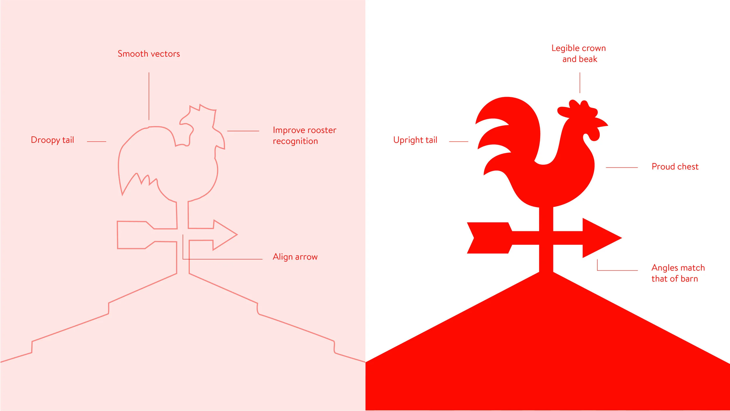
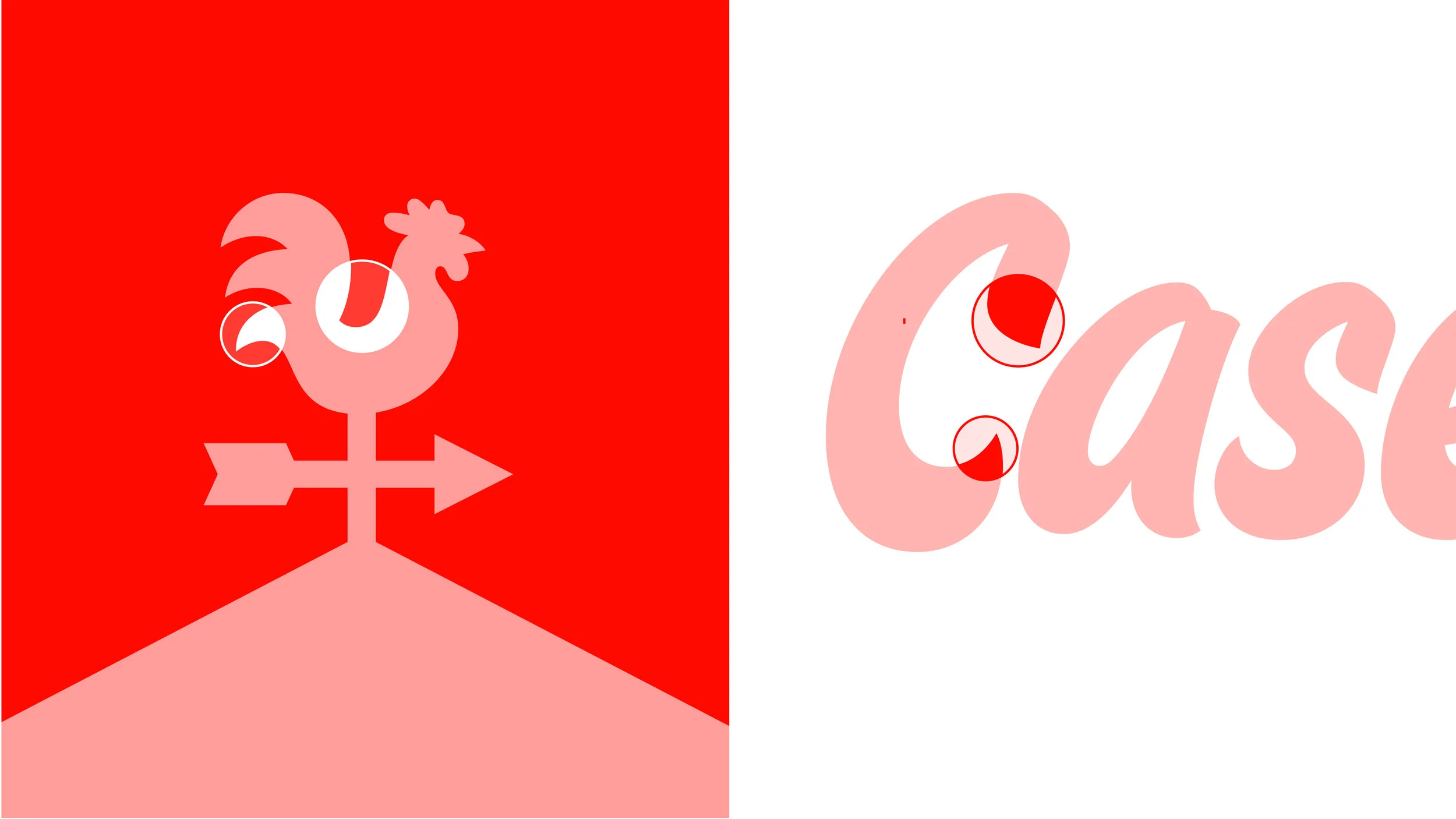
The final logo retains and optimizes the barn for digital environments by removing the shingles and adding defined eves. Typographer Jesse Ragan custom cut the logotype to improve legibility while retaining the quirky characteristics. The new logo also elevates the weathervane as a key brand asset with an improved rooster illustration that reflects the forms of the logotype. These uniquely combined design elements allow the logo to flex into everywhere it needs to show up.
Private Label Brand
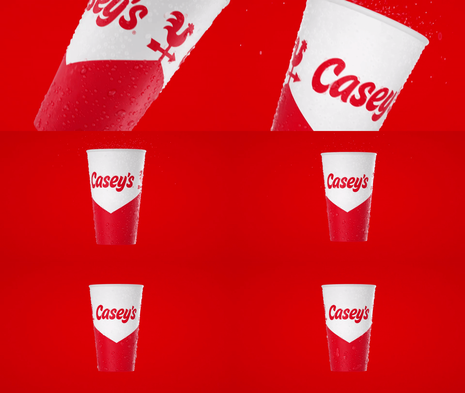
While the full brand roll-out will be a multi-year process to update 2,200 stores, one of the first instances of the new identity is the expansion of Casey’s private label brand. Interbrand worked with Casey’s team and various vendors to bring sodas, juices, teas, baked goods, chips, nuts and trail mix to market in the coming months. To create an adaptive system that could stretch across the varied line of products, we restructured the core elements of the logo into a bold, graphic design language. The flexible system will then be extended across the wider experience including signage, uniforms, app, livery, and to-go packaging.


